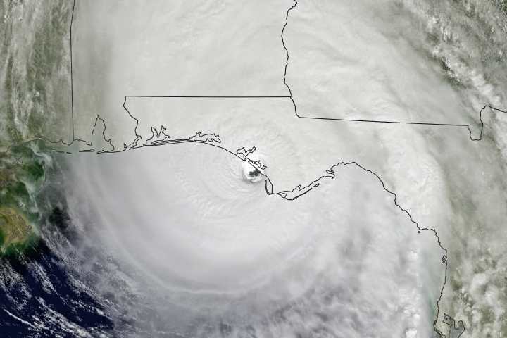
The graphical presentation of the National Hurricane Center’s cone of uncertainty has specific meaning.
“The cone represents the probable track of the center of a tropical cyclone and is formed by enclosing the area swept out by a set of circles (not shown) along the forecast track (at 12, 24, 36 hours, etc). The size of each circle is set so that two-thirds of historical official forecast errors over a five-year sample fall within the circle.” That is the official definition from the National Hurricane Center, and it means two things: that the circles themselves are variables and that it accounts for only two-thirds of the track errors, not all of them.
That small circle showing the position of the cyclone’s center at the time of the forecast (labeled S, H or M to indicate strength) is the only part of the graphic that isn’t an estimate. Everything else about it is simply the best educated guess to be made with the always incomplete and constantly changing data. To fully grasp the size of the area that might be affected by tropical storm force winds you would need to have another asymmetrical circle shape of accurate scale that equals that wind field and, using its center, trace around the perimeter of the cone of uncertainty.
That now much larger swept area would be your no-go zone. And even then, because of all of the various forecast errors and uncertainties, as well as the possibility that the wind field may expand, it should be understood that it possibly under represents the area that could be affected (and dangerous to navigate in) by a significant margin.
However, the appropriate warning is shown boldly at the top of the graphic. “Note: The cone contains the probable path of the storm center but does not show the size of the storm. Hazardous conditions can occur outside of the cone.”
I think “will occur” would be more accurate. Translation: Make sure you fully understand what you’re looking at and what you are reading before you start making critical decisions.